Gordon Gregory Photography
Let's face it: When you live a busy life with young kids, it's easy to relegate your home to the "safe" zone, opting for boring, durable essentials and necessities that will be swapped as your kids grow, instead of investing in style and quality. But luckily for designer Sara Hillery, the young family that tapped her to overhaul their Richmond, Virginia, home didn't see the messiness of family life as being at odds with a beautiful, antique-and-art-filled house.
"The house wasn't really working for them, but they loved the neighborhood, so they thought, 'How can we stay put but make this better?'" The answer: Rethink spaces and surfaces to prioritize function and incorporate happiness through the decor.
"The first thing we did was put an addition on the back to give two living spaces instead of one," says Hillery. That way, there was room for a dining room for adults and a playroom for kids. "Then we blew out some walls on the first floor and made what was a tiny, dated kitchen into an open one with a family room." With this framework in place, Hillery moved onto the interiors, infusing pops of color and pattern that make for a joyful setting—that's still plenty practical.
Go bold with your paint
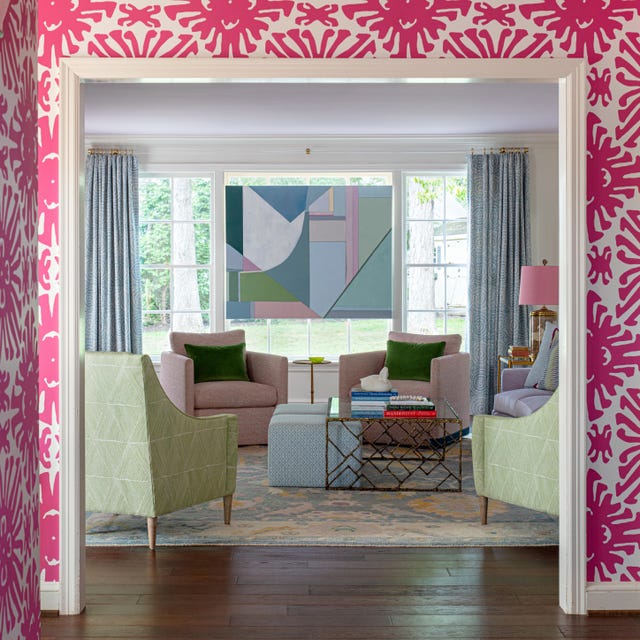
Family Room
With the living room open to the entry and backyard, it gets tons of use. "The kids can run through the house and you don't have to really worry about breaking anything," laughs Hillery. That's especially true given the furniture she selected, an assortment of soft, upholstered pieces (many in performance fabrics!) and round case goods set atop a wool rug from Anthropologie ("We wanted something super dog and kid friendly," quips Hillery). An array of seating types makes the room multifunctional, with options for kids' reading time and adult cocktail hours alike, from the Hickory Chair sofa to chairs from Highland House—timeless pieces that are well worth the investment.
Kitchen
Talk about high-performance: "The countertops are all quartz, so they don't have to worry about spaghetti sauce," says Hillery. And, while the family does have a formal dining room (more on that below!), the designer notes that, for the "active" group, countertop seating was still crucial: Stools that wrap around the island make it feel more like a dining table when the family is having meals there. Meanwhile, painting the ceiling a light shade of blue (a nod to the Gullah-originated Haint Blue hue common on many porches in the South) gives the appearance of better natural light.
While the kitchen may be the most muted of the home's rooms (timelessness was key here), Hillery did manage to squeeze in a bit of a pop by way of the desk setup along one wall, an element that turns the kitchen into something of a family "command center."
Dining Room
Because this is very much a "forever home," forward thinking was crucial. "They realize right now in their life, they've got little kids, and so they probably won't be doing a whole lot of sit-down dinners, but as their kids get older, that's something they would look forward to," explains Hillery. But, to keep the space from feeling anywhere close to stuffy, the designer opted for chairs in a mix of colors and a bold zebra print wallpaper. "This room just has such a fun splash of color that they really look forward to using it," says the designer.
Other bold green wallpapers we love:
Bar
Proof that no good designer lets a square foot go unused: When the new layout left an awkward corner, Hillery turned it into a bar, which she lacquered green for a bold statement. "At first they weren't sure if they wanted it—or would use it—but now it's one of their favorite things in the house," says the designer. And, since the homeowner "wanted to wallpaper every room!" as Hillery puts it, even this teeny space got a swath of pattern on the ceiling.
Bathroom
This bold bathroom is directly across from the kitchen desk, which picks up the magenta in the Lulie Wallace wallpaper. A modern marble vanity keeps the space from feeling too sweet.
Laundry
"We really designed this space around the midcentury light, which I found in an antique store," says Hillery. The resulting room is a place where laundry seems like less of a chore, thanks to the chic surroundings. Even the most functional elements are pretty: A lucite hanging bar, for example, takes the place of your standard-issue drying rack. "There's a pocket door there that, when it's open, allows a view in here from the dining room, so we wanted to be sure it was pretty to look at," says the designer.
Exterior
The family's living space extends outside, to a patio complete with a dining table and outdoor fireplace. "It's as much indoor-outdoor living as we could get in this location," says Hillery. We'll take it!
More Inspiration
This content is created and maintained by a third party, and imported onto this page to help users provide their email addresses. You may be able to find more information about this and similar content at piano.io
"House" - Google News
November 25, 2020 at 05:42AM
https://ift.tt/33fn45m
Sara Hillery Creates a Colorful, Family-Friendly House in Richmond - HouseBeautiful.com
"House" - Google News
https://ift.tt/2q5ay8k
Shoes Man Tutorial
Pos News Update
Meme Update
Korean Entertainment News
Japan News Update
Bagikan Berita Ini


0 Response to "Sara Hillery Creates a Colorful, Family-Friendly House in Richmond - HouseBeautiful.com"
Post a Comment